WARMLAB
WarmLab is an entertainment business that promotes Minimal-House music by organizing music parties and events. Due to the Covid-19 pandemic and subsequent restrictions, the business needed to press pause. But now they are ready to relaunch and a website is a vital part of their business plan.
0. Business research.
Before starting the design process our team did some preliminary business and user research. We conducted a SWOT analysis and determined that WarmLab’s strength is their niche music event offering, an obvious weakness is that they don’t have a website, an opportunity is that people are excited to go out and party post lockdown and a threat is that WarmLab is one of many music event promoters.
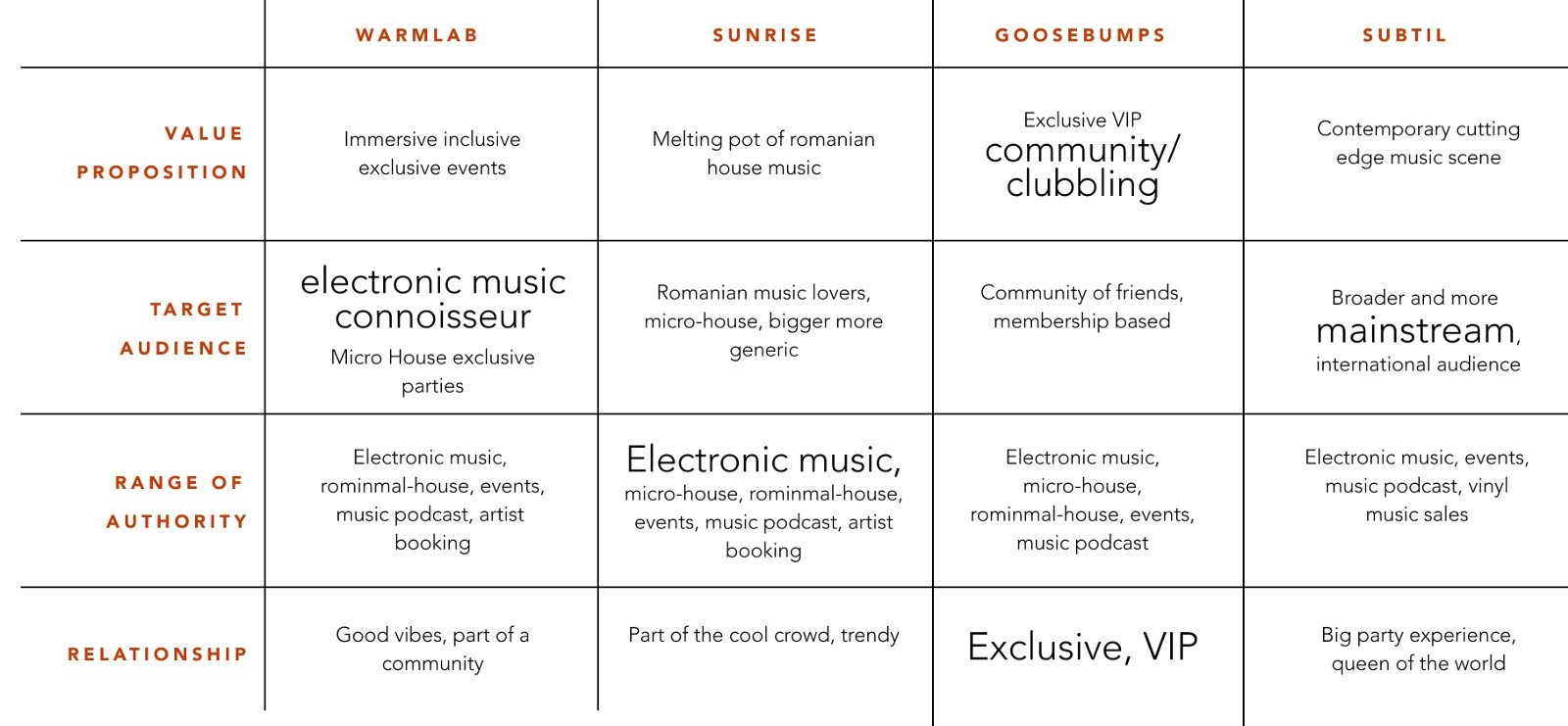
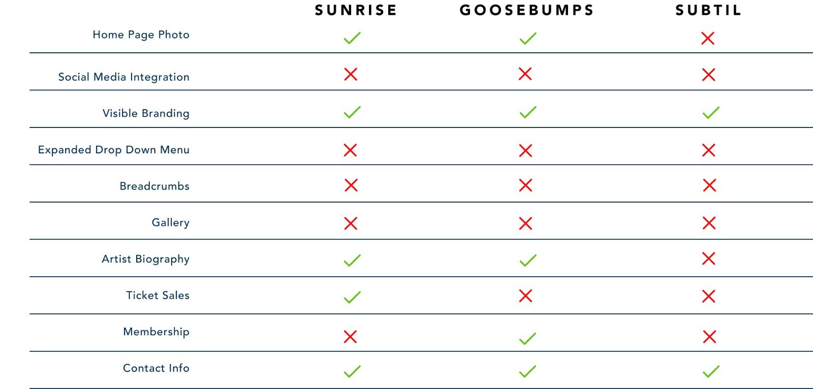
With this information, we did a competitor analysis to profile WarmLab and define their brand in the context of their direct competitors. This was followed by feature comparison to determine what WarmLab’s website would need based on other online offerings and what additional features they could have which would make them stand out.
1. Empathise.
We conducted user research by doing interviews with people that aligned with the WarmLab target market. We wanted to find out what users liked and disliked about online ticket purchases and how they carried out this process. We were curious about their knowledge of the genre of music that WarmLab promotes and what would prompt them to buy tickets to these events. Lastly, we asked the users about what information or features they would expect to see on an event promotion website.
A few interesting quotes from our interviews:
“I would like to be able to buy and access tickets from the official website.”(Marc)
“I expect to see artist, performance info, price and times.”(Jenny)
“I don’t like it when I am forced to log in straight away.”(Jose)
“I want to know how many people are attending the event.”(Jose)
“I want to see the name of the event big and bold so that I know for sure what I am buying tickets for.”(Maria)
We gathered and organized all of the user information from these interviews using an Affinity diagram and from this, we created a user Empathy Map.
The Empathy Map really helped us to think about the specifics of the user experience. The empathy map gave us a clear idea of who our user is and what they do, see, say, and hear. As well as their pains and gains.
The empathy map led to our user persona.
Our User Persona is “Micro Minimal Mihail”. He is a 29-year-old, living in East London. He loves to go to electro music events that have a good vibe, where he can feel unique at the same time as being part of a community. But he is new to London and hasn’t connected with many people due to the pandemic.
He wants to know when events playing his favorite music are happening and where. He would like to be the first to know about early bird ticket specials.
He wants to be able to access information about his favorite artists and find new music. He would like to be part of a music community of friends. With this information, we developed a User journey Map.
The User Journey Map detailed Mihail’s experience of coming home from work on a Friday evening, wanting to go out but not knowing what events are happening. This results in an online search for events which is frustrating until he finds an event website to help him, but then gets redirected to a different website to buy a ticket.
2. Define.
By identifying the low point in the user journey we were able to determine specific UX opportunities for our product and define our problem statement.
We also thought about our product in terms of a series of “How Might We” statements to help refine our potential solution.
How might we…
… simplify the online purchase of music event tickets?
… help the user to know more about Minimal house events?
… help our user to be a part of a Minimal community?
Next, we brainstormed as a team to determine our Minimum Viable Product (MVP) by deciding what features our product must have in order to satisfy the business and user needs. These features included event information (date, time, line up, people attending, and venue), music artist bios, ticket purchase functionality, and a secure banking back-end
Our ideation kicked off with creating a site map that determined the structure of the website and content hierarchy.
We chose to first focus on the UX of the ticket purchase process and set a user task of “Buying 4 tickets to the Resurface event on 31 July and using Apple pay to purchase the tickets.” From the site map we were able to determine a happy path which we expressed as a user flow, including every step in the process.
To refine the details we developed epics and user stories. One of our epics was “buying a ticket for an event” and we brainstormed user stories for this to make sure we had thought of all the details such as promotions, price, quantity, unit cost versus total cost, payment methods and security.
3. Prototype.
With the ideation phase complete we created low fidelity wireframes for our “happy path”. Each member of our team made sketches of their ideas and then we consolidated them into wireframes that pulled together all the best ideas and features.
The task outlined for our happy path was as follows:
We also created lo-fi wireframes of the artist bio page and gallery page. These low-fidelity wireframes were then used for user testing to check out design ideas.
Some adjustments were made based on feedback from the user testing and then we created mid-fidelity wireframes in Figma for prototyping and useability testing.
We got lots of feedback from our testing, both qualitative and quantitative. Here green represents positive feedback, red is negative, and blue shows suggestions.
Using the mid-fidelity wireframes in conjunction with the feedback received, we created a prototype for usability testing.
We got lots of feedback from our testing, both qualitative and quantitative. In the image below green represents positive feedback, red is negative, and blue shows suggestions.
As a team, we filtered the feedback and chose what to address immediately and what would become part of the next project phase. We prioritized changes that affected usability and made any adjustments that would improve the user experience.
Below is a demo of our mid-fidelity prototype after the updates had been implemented.
As the next step in this project, we want to all get stakeholder input before starting work on the high fidelity prototype. At the same time, we will address the rest of the feedback from our usability testing such as a search function, links to artist profiles, and how to buy tickets to multiple events. We also want to work on the functionality of the membership feature which will grow the WarmLab community.
And then to build the site so that WarmLab can do what they do best!


